Contrast In Art Painting
What Is Contrast in Painting? (Definition & Why It Matters)
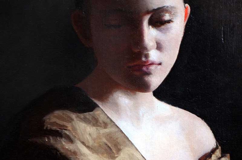
Example of Strong Contrast: Light Object Against Dark Background
What Is Contrast in Painting? (Definition & Why It Matters)
A light-colored object placed against a dark background is a clear example of contrast in painting. This contrast in value helps the viewer recognize these as two distinct objects and creates an illusion of depth. When an object shares a similar value with the background, it becomes more difficult to distinguish. A helpful guideline is that objects in the foreground, which are closest to the viewer, generally display higher contrast with one another. In contrast, objects in the background are usually painted with similar values, making them appear farther away.
The Power of Value Contrast (Chiaroscuro & Light/Dark Drama)
An artist can increase or decrease contrast in a painting in a variety of ways. For instance, textures can be used to illustrate how objects differ. Illuminated objects appear lighter than those that fall in shadow. A bold difference between light and dark can be referred to as chiaroscuro. Chiaroscuro techniques can make a painting seem dramatic. I believe that it's easier to paint an object lit with chiaroscuro lighting than a scene of similar values. A painting lacking bold lights and shadows often relies upon subtle color changes to define forms. Creating subtle color changes can be harder to master. The shadow shapes that exist in boldly lit scenes do much of the work for you. Learning to modify the contrast in values can draw attention to an object, subtly directing the viewer's attention.
Easy Way to Add Contrast: Separate Subject from Background
Here's an easy way to add contrast to a painting. When painting a portrait or an object, notice where the edge of the face meets the background. Are they similar in value? If so, consider darkening the background in that area or gently lightening the edge of the face. Next, check out the opposite side of the figure. If the hair and background are too similar in value, lighten the adjacent background slightly. Mottling a background can make this easier. Dark hair bordering a lighter background makes it seem like there is a distance between the model and the background or wall. It creates a visual separation. This simple method can be used in portrait painting, still-lifes, and in landscapes to differentiate one object from another.
Contrast in Color: Using Complements for Focal Points & Pop
Another easy way to use contrast when painting is to use contrasting colors. Complementary colors can be placed next to each other to draw attention to a specific area like the focal point. This is especially useful if the rest of the painting has subdued color. In a mostly neutral painting, a pop of color can be an attention-grabber. To use this method, simply use yellow next to purple, red or pink next to green, or orange next to blue.
Contrast in Color Temperature: Warm vs Cool for Natural Form
Color temperature is a subtle but important aspect of creating contrast in a painting. Changes in color temperature occur naturally as we observe and paint. Artists adjust the color temperature as they move around the subject. These adjustments are especially useful when rendering objects that are partially in light and partially in shadow. For instance, if an object is illuminated by warm light, its shadows may appear cool in temperature. Cool colors tend to lean toward blue or purple, while objects lit by cool or blue light may have warmer shadows that display more orange or yellow tones. A single pink flower may require a range of cool and warm pink oil paint colors, depending on the light source.
Contrast Through Texture: Differentiate Surfaces & Materials
Incorporating various textures in a painting adds contrast effectively. A smooth surface placed next to a rough surface can create a striking contrast between the forms.
The Perceptual Science of Contrast in Painting
Contrast exploits fundamental mechanisms of visual perception to create depth, separation, and focus on a flat surface. Value contrast between light and dark leverages edge detection and shape from shading cues. Strong luminance differences signal object boundaries and occlusion, allowing the brain to infer three-dimensional structure. Foreground high-contrast separates subject from low-contrast background through figure-ground organization. Look up gestalt principles. Similar values cause fusion and recession. This explains why background objects appear distant. Chiaroscuro amplifies this: dramatic light and shadow creates steep gradients that trigger stronger shape inference. Color contrast of complements produce heightened perceived intensity (simultaneous contrast), drawing attention and creating focal points without increased luminance. Temperature contrast mimics natural illumination: warm light (higher long-wavelength energy) casts cooler shadows (blue bias from reduced direct illumination), while cool light casts warmer shadows. Texture contrast signals material differences and spatial separation. Together, these contrast types guide viewer attention, enhancing depth perception. Using contrast in a painting can help override perceptual flattening and create realistic illusions of space and form.
Conclusion: Combine Contrast Techniques for Stronger, More Realistic Paintings
Using various textures, light, shadow, complementary color pairs, and color temperature can be powerful techniques for creating contrast in a painting. These elements are useful for depicting objects, places, and people. I've shared a few simple ways to use contrast, which helps visually separate your subject from the background. I hope you find this helpful!
Related Topics: